
TL;DR: Kuala Lumpur’s problem isn’t simple sprawl. Compared with global peers, KL is unusually compact but still relatively sparse. That means KL has room to grow inward, connect better, and make density liveable.
Before I’ve even begun, I’ve alienated many of you with this post’s title.” For my younger readers and those who may have forgotten, it’s a version of Bill Clinton’s catchphrase from the 1990s – “it’s the economy, stupid!”
Most Malaysians associate Kuala Lumpur (and Greater Kuala Lumpur / the Klang Valley) with having to travel long distances, stuck in heavy traffic. This stereotype resonates especially with Malaysians from other parts of the country. Most people call this sprawl. Thankfully, we have do have enlightened leaders who continue to champion the cause against sprawl (see the Malaysian Deputy Minister of Finance Liew Chin Tong’s post for example here, who recently spoke about Malaysians’ penchant for sprawled suburbs and dependency on private vehicles, leading to an empty inner city).
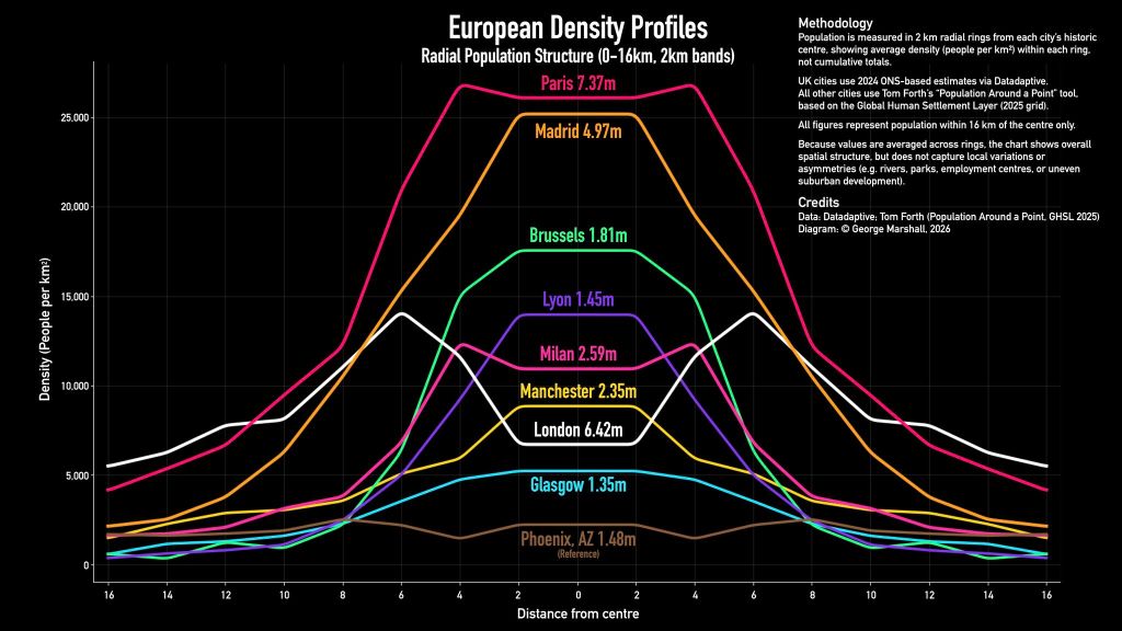
Initially, I merely wanted to explore population density and distance from the city centre for Kuala Lumpur and other Malaysian cities. I was inspired by this data visualisation on European city density profiles by George Marshall on LinkedIn (Exhibit 1). This then led me down a rabbit hole for over a month. The output of that is this entire project.
The average resident experiences their city through density and distance
Trying to quantify the experience of the average resident living in Greater KL, is near impossible. There are too many variables and each person would have different innate preferences. They would weight variables differently. For instance, I value convenience and I hate driving. Plus I’m really lazy. So I prefer denser neighbourhoods that have convenient amenities within short walking or driving distances. On the other extreme, I have friends who love suburban life and live in gated and guarded communities, away from the chaos of the city and people of other demographics.
Nevertheless, the “study” must go on! We have to start somewhere. There are two important measures of how people experience their city (Exhibit 2).
How the average resident experiences their city
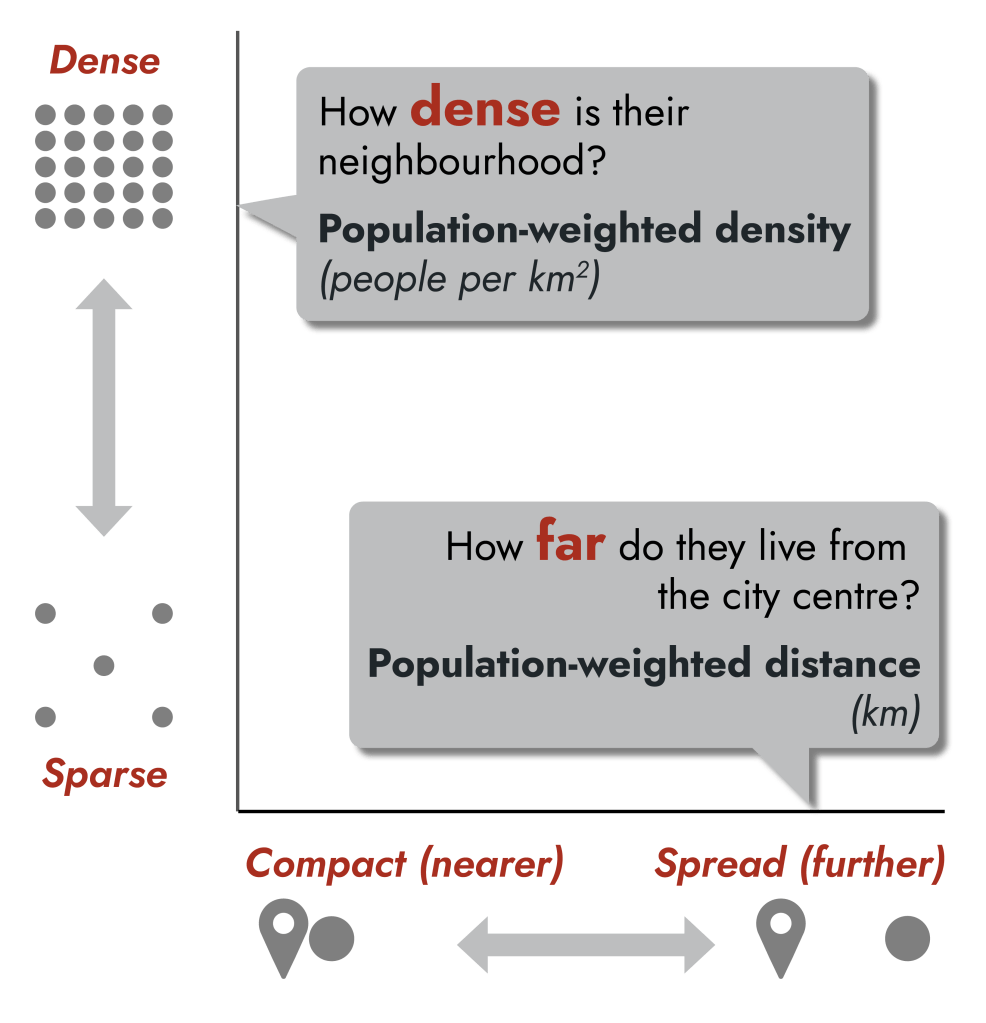
First, how dense is the neighbourhood they live in? I calculated “population-weighted density” which can be measured by people per square km. Note that this is a very different measure from how dense the city is overall. Essentially, I only considered areas that people live in. I totaled the number of people and divided it by the total size of the land that they live in.
Second, how far do they live from the city centre? This is “population-weighted distance”, measured in km. How far is the average person’s house from the city centre?
I can see the gears of your mind whirring fast. Let’s tackle your questions as they sprout up.
Why choose the city centre as the reference point to measure the average centre’s distance?
Most people’s commutes involve shuttling between their homes and where they work/study. The bold assumption here is that most work/study locations are in the city centre.
Where is the city centre?
There is no official answer for KL and practically all the global cities that I analysed. Common choices include administrative centres, historical centres (i.e., where the city “began”), transit hubs, key landmarks, and central business districts (CBDs). Even if you pick one, they tend to shift over time. Consider where the CBD is in your home city. For KL, arguably it was historically the downtown area around Masjid Jamek / Petaling Street which then moved to the Golden Triangle, and then shifted slightly to the KLCC area. Today, there are multiple CBDs in KL including KL Sentral and Bangsar South. In this analysis, I used generally accepted historic centres. For Kuala Lumpur, this was the kilometre-zero marker at Dataran Merdeka (Independence Square). I also tested a version that used the main transit hub, KL Sentral as the city centre and the results were very similar.
Wouldn’t the choice of historic centre instead of the current CBD affect the results?
Yes, definitely. However, using the historic centre is superior for several reasons. It allows us to be internally consistent when analysing a diverse range of global cities. We may dispute where the current CBD is as its location changes over time. However, the location of the historical centre cannot change. Also, using the historical centre reveals how cities may have grown and spread in different directions and densities for various reasons.
How do you know what the population size is and where the population lives?
Ideally, I would have used official statistics from the Department of Statistics, Malaysia. This data exists as the government conducts a national census every ten years. Unfortunately, the data is not public and the only official open data published is too aggregated – generally at the mukim (sub-district) or various district (i.e., administrative, parliamentary, or state legislative assembly) levels. This data is not granular enough for our purposes. Fortunately, there are open datasets for global population created using different approaches, such as by combining subnational census data, machine learning techniques, building footprints, and satellite imagery. Two commonly used credible datasets are the European Commission’s Global Human Settlement Layer (GHSL) and the University of Southampton’s WorldPop. More on the population data later on!
How did you decide which areas of the city to include/exclude?
Generally, only land areas were included. Any water bodies (rivers, lakes, seas) where excluded (“masked”) from the analysis since most formal housing is immovable and built on fixed land. The dataset used to identify water bodies was the JRC Global Surface Water Layers. I did consider excluding inhospitable terrain (e.g., hills and mountains, industrial and waste sites) and protected areas (e.g., nature reserves, agricultural zones). However, this would involve the consideration of even more assumptions and analysing heaps of data which meant that this personal project would never be completed.
Kuala Lumpur is an outlier among global cities – it is sparse and compact
I then compared KL against a sample of 18 global cities. These cities were selected to be representative of different regions and urban growth patterns. Some are very old. Some are much younger. Some started on the coast, by a river, or an island that constrained their growth. Others were in the middle of wide empty land with plenty of room to sprawl.
The results are shown on a matrix of population-weighted density against population-weighted distance (Exhibit 3). The median values of the selected cities’ population-weighted density and distance are shown as dotted lines on the chart. These dotted lines demarcate the quadrants for the matrix. Cities can be grouped as either dense and compact, sparse and compact, dense and spread, or sparse and spread. Note that the quadrant a city belongs to is dependent on the peer group of cities analysed.
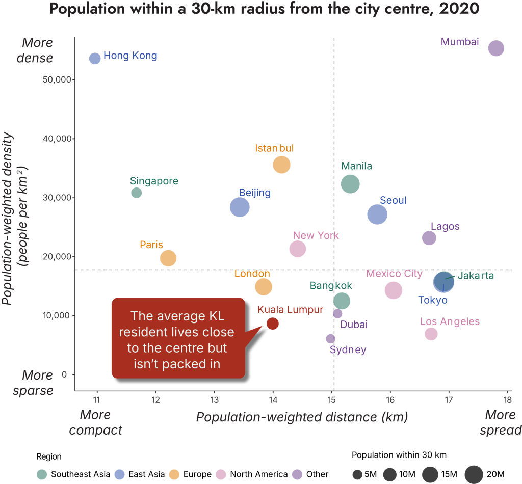
The matrix reveals several immediate insights. Kuala Lumpur is an outlier. It is in an unusual quadrant at the bottom-left – sparse and compact. The only two other cities located on the edges of this quadrant are London and Sydney. KL has a spread similar to London, New York and Beijing, but these cities have approximately double, triple, and quadruple the lived density of KL. The average KL resident lives in a neighbourhood with density levels closer to Dubai, Los Angeles, and Sydney.
A key point, which is discussed later is that the lived experience in cities with similar density and distance can be very different. Tokyo and Jakarta overlap in this matrix. Tokyo is known for its fast and efficient public transit and is a very well-connected metropolis. Jakarta is of a similar size to Tokyo. But my impression from the early 2010s is a city of macet, hours spent in traffic congestion. An urban planning colleague who has been to both Tokyo and Jakarta tells me that this overlap makes sense – her experience of the vibe of both cities’ was similar. Of course, every person will have their unique experience of a city. Here, we are trying to understand the average experience, though that is a misnomer in itself.
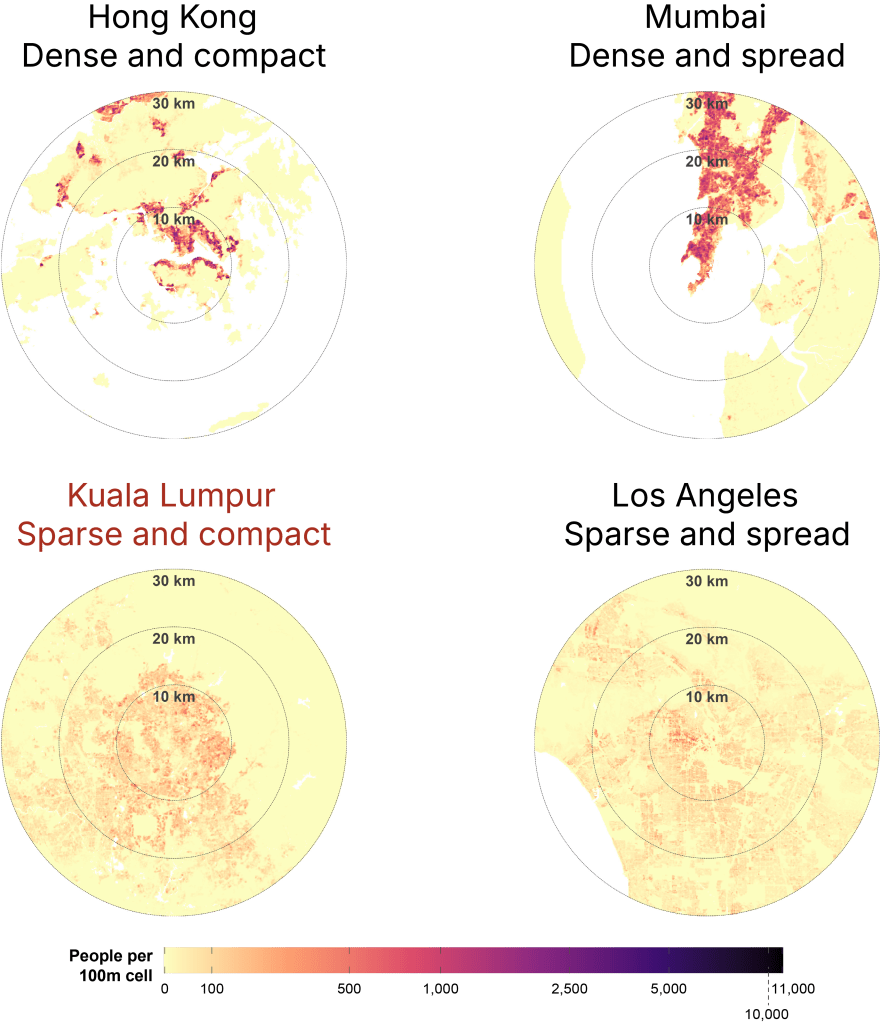
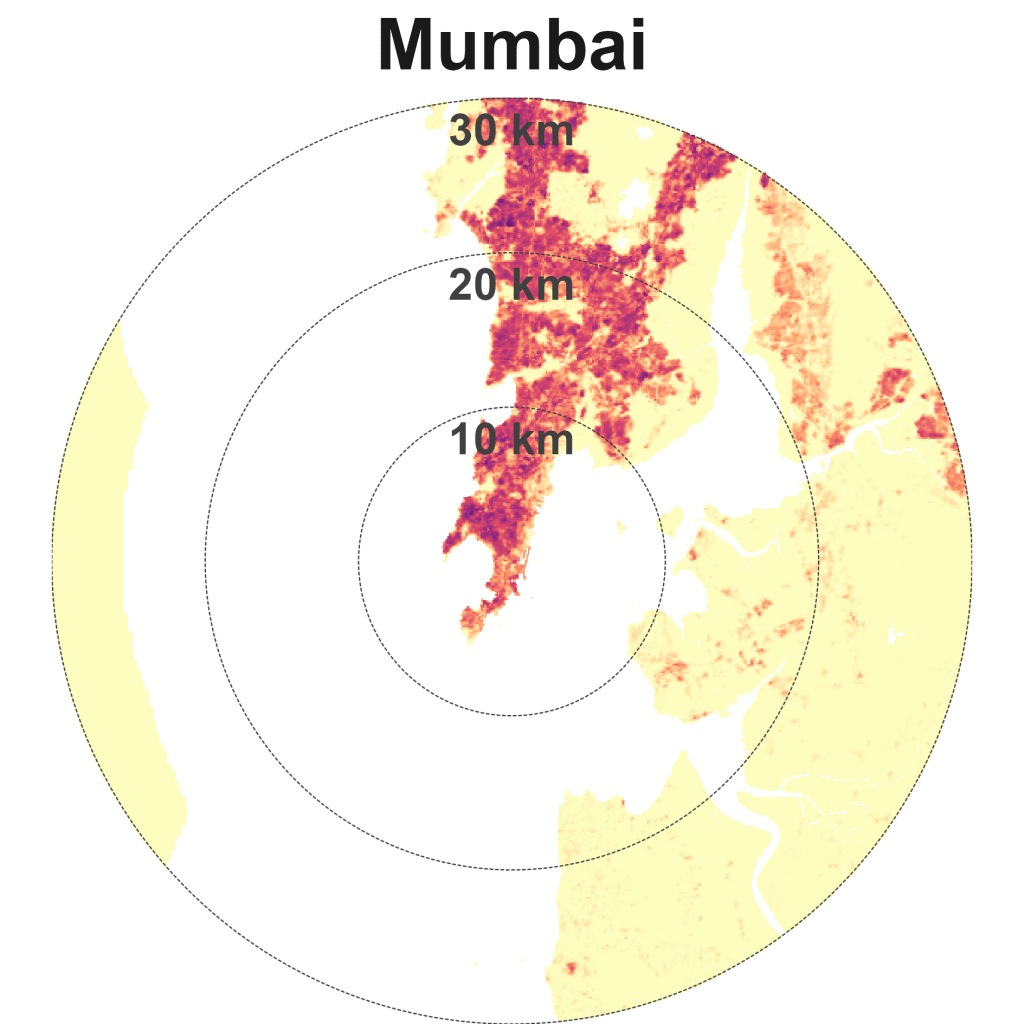
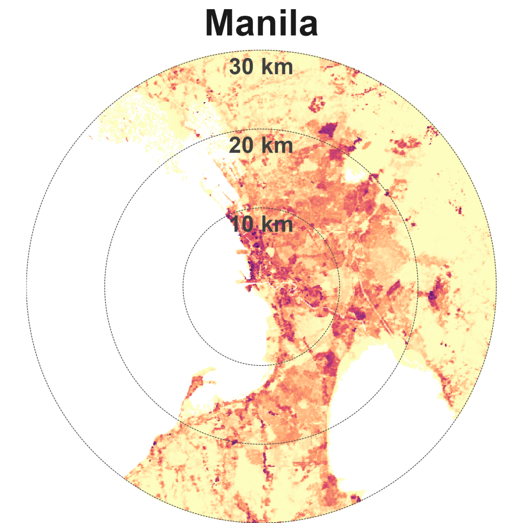
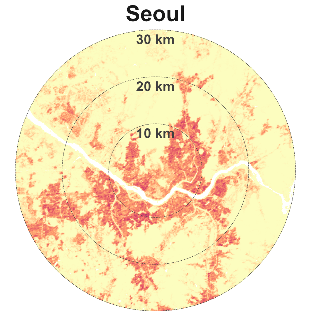
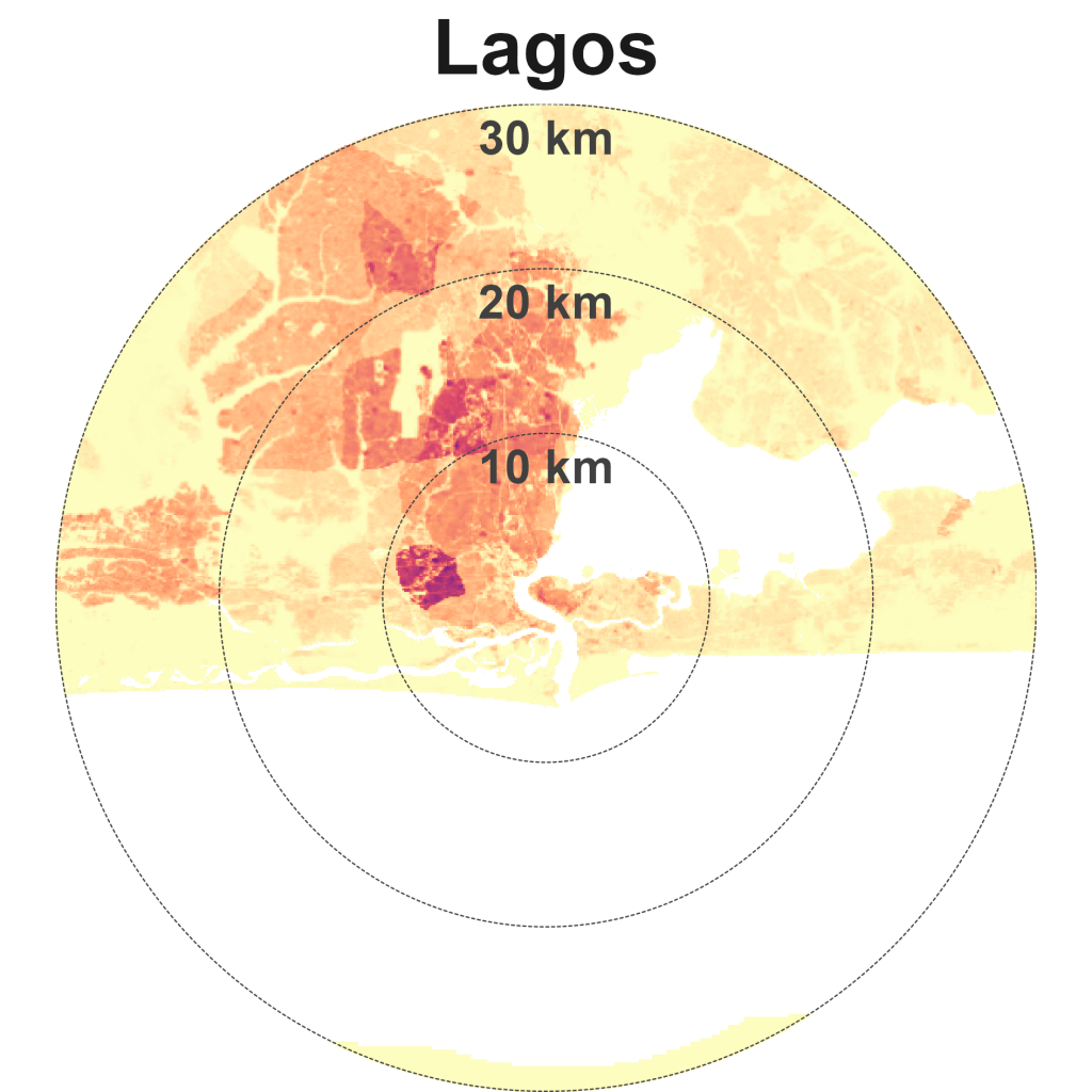
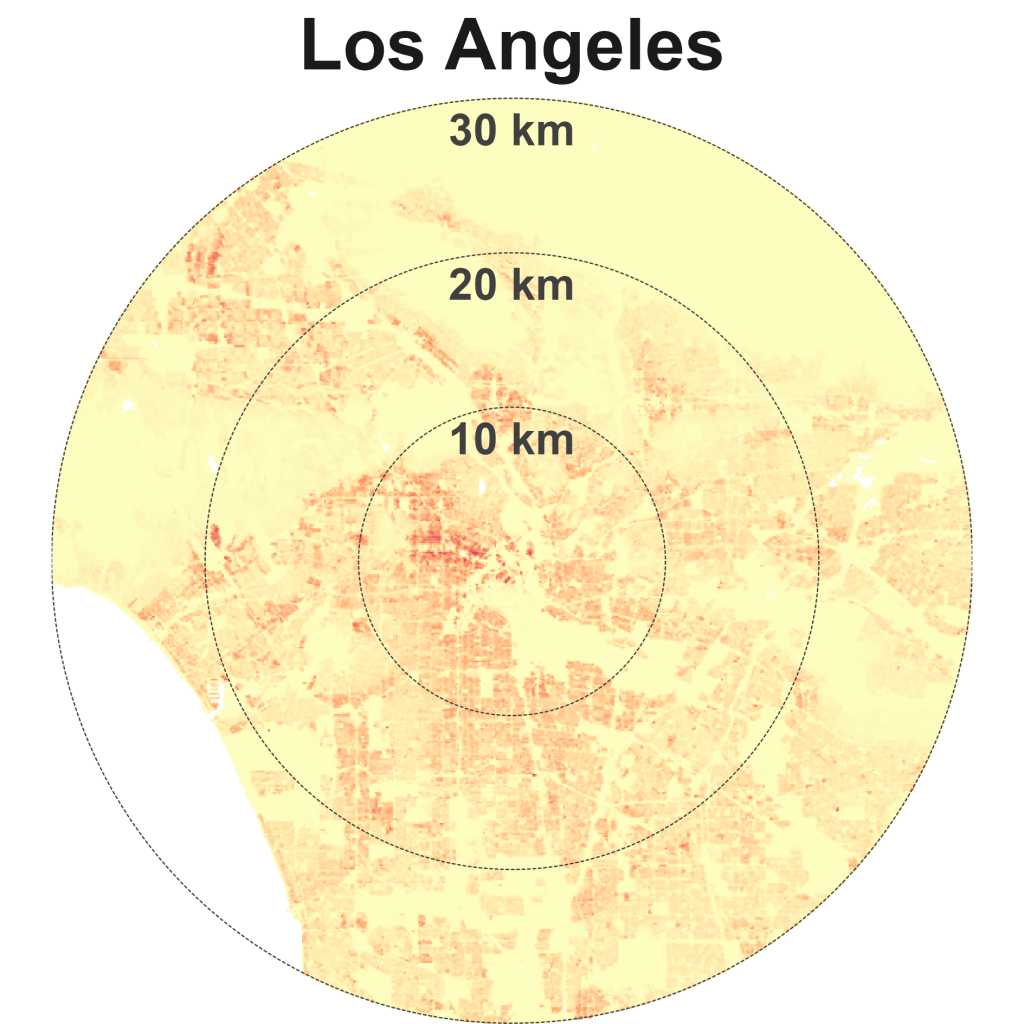
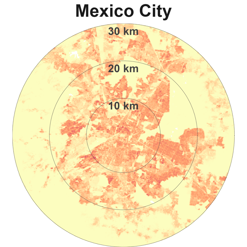
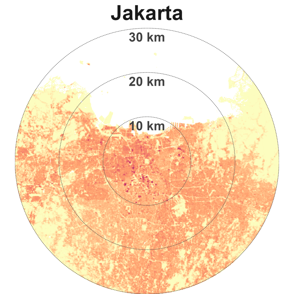
Next, let’s examine outliers that represent each of the four quadrants more closely (Exhibit 4). Using a 30-km radius and the same colour scale bar to represent population density we can visually compare how different the four quadarants are.
Dense and compact cities
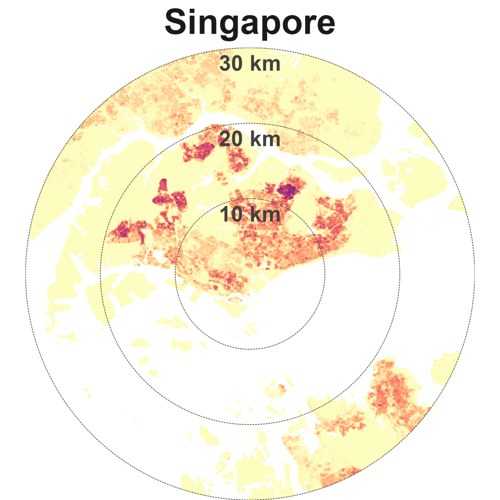
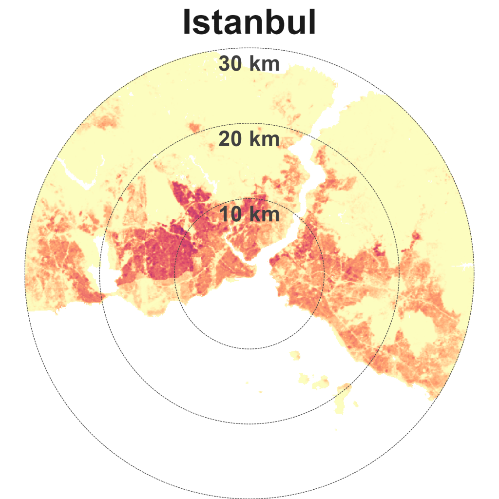
Hong Kong is dense and compact. Other cities in this quadrant are Singapore, Istanbul, Beijing, Paris, and New York.
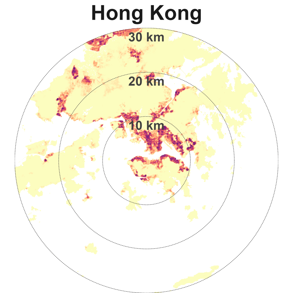
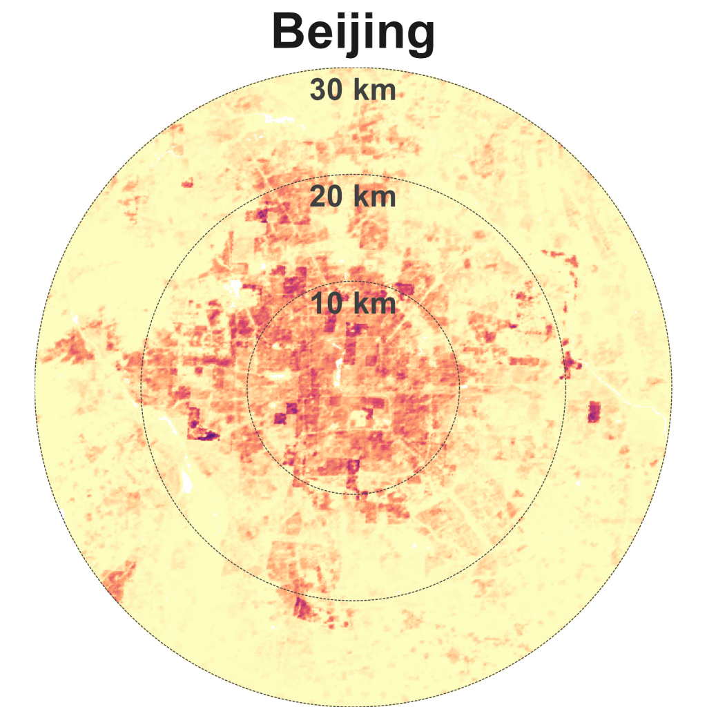
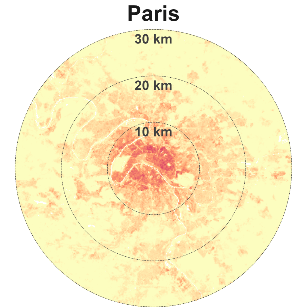
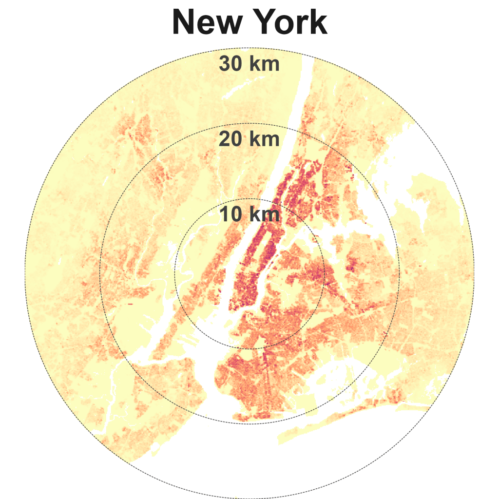
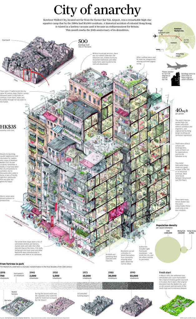
Hong Kong has among the highest population densities in the world. The now demolished Kowloon Walled City, infamous for being a “city of anarchy” and a “city of darkness” is representative of this density, dialled all the way up (Exhibit 5). Before it was demolished, It had an estimated 50,000 residents, equivalent to a density of 1.92 million people per square km! However, much of Hong Kong is less dense and even undeveloped (a consequence of its hilly terrain), with plenty of protected nature sites.

This infographic below, published in the South China Morning Post depicts what life was like in the Walled City (Exhibit 6). Today, a public park stands in its place.
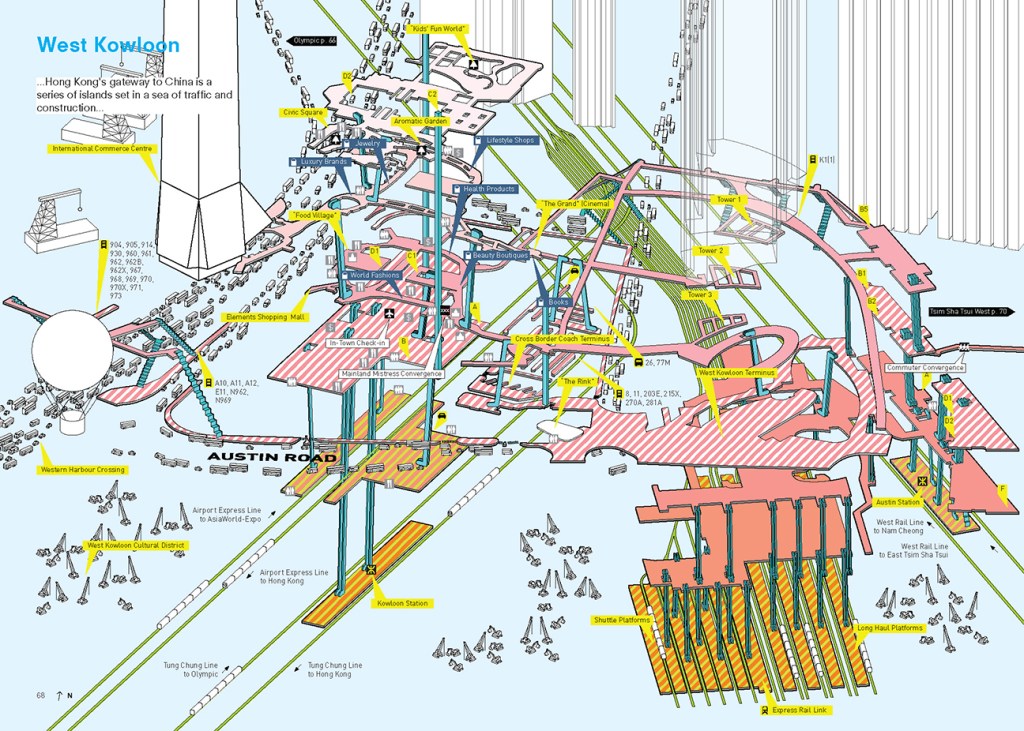
Density is not just about building aboveground, reaching for the skies. Promoting liveable, walkable density can be done through investing in underground connecting infrastructure, e.g., pedestrian walkways that connect the underground, street level, and overground. See for example, Randomwire’s post “Hong Kong – City Without Ground”. He highlights the book Cities Without Ground: A Hong Kong Guidebook by Adam Frampton, Jonathan D. Solomon and Clara Wong that illustrates pedestrian walkways in 3D (Exhibit 7).
Dense and spread cities
Mumbai is dense and spread, alongside Manila, Seoul, and Lagos. I’ve yet to visit these four cities, so don’t have much to say about them for now.

Sparse and spread cities
Los Angeles is the quintessential city of sprawl – relatively low-dense and car-dependent (Exhibit 8). Other sparse and spread cities are Mexico City, Jakarta, Tokyo, Bangkok, and Dubai.
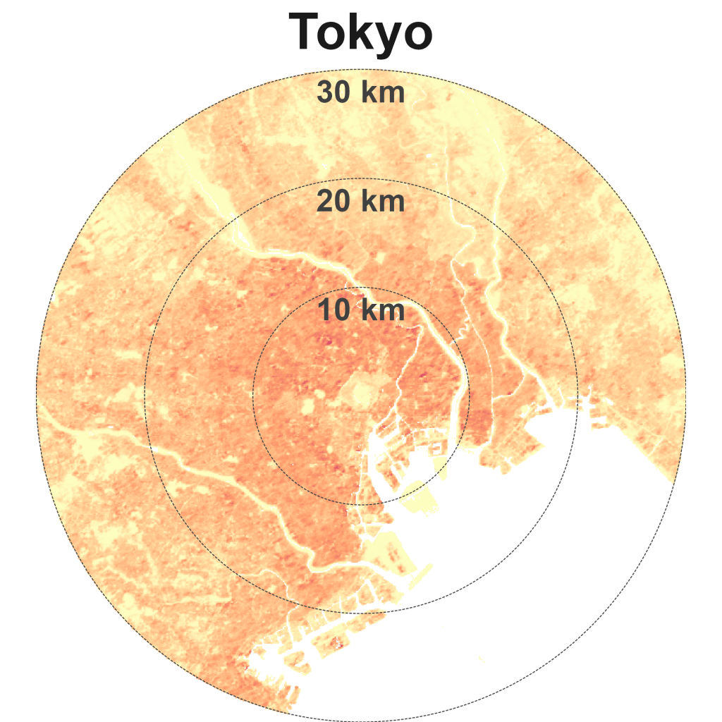
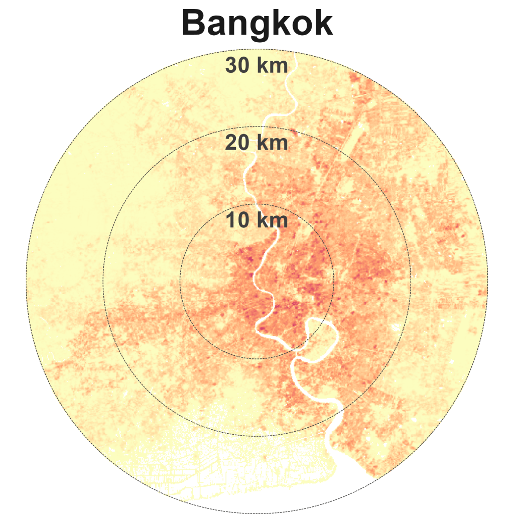
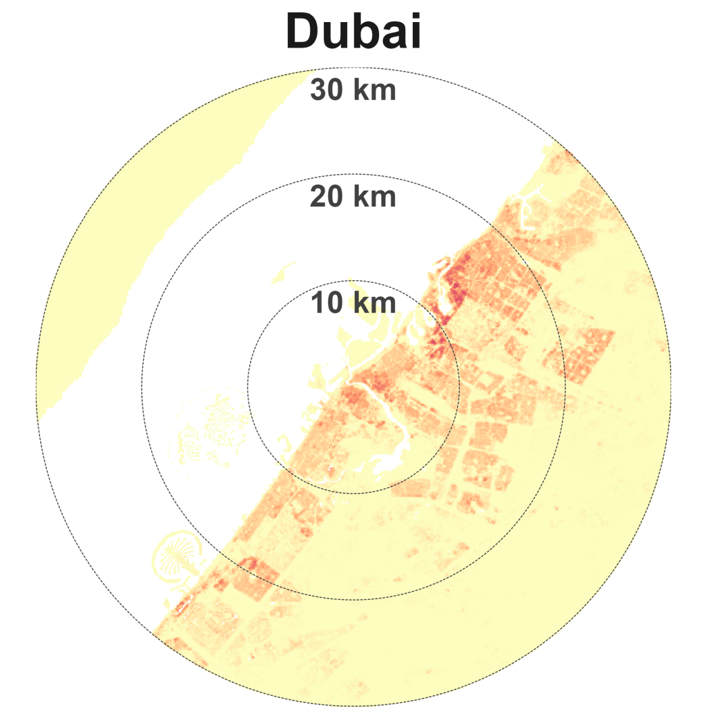
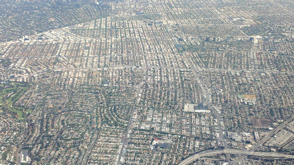
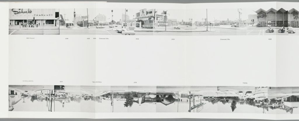
LA’s historical urban patterns of low-density sprawl live on today. In 1966, the American artist Ed Ruscha documented the 2.6 km Sunset Strip, part of the 38 km long Sunset Boulevard (Exhibit 9). I wonder if the creators of Google Maps’ Street View were inspired by Ruscha’s artwork “Every Building on the Sunset Strip”. Ruscha continued to document the Boulevard over 50 years and his work can be viewed online, archived by the Getty Research Institute here.
Joanna Pocock documented her journey across the US in 2006 and again in 2023 by bus in Greyhound: A Memoir, published in 2025. Greyhound is recommended reading for urbanists. These quotes on sprawl give a taste of Pocock’s writing:
Very little of this segregation, and how these histories are reinforced or resisted, is touched upon in the Great American Road Trip books written by men driving their cars. In a car, the driver is removed from the communal, from difficult histories, from the people who, behind the scenes, are keeping much of the country going with little fanfare and very little money: the cleaners, care workers and manual labourers, or more precisely, anyone who isn’t them.
Joanna Pocock – Greyhound: A Memoir (2025), p. 114.
We’ve come to expect sprawl as an inevitable consequence of cities, and cars as a simple extension of this inevitability. This is a problem of imagination which illustrates so perfectly the disassociation we have created between our very bodies and the material world we inhabit.
We can’t divorce our dependence on cars from our dependence on oil. Cars have created sprawl and oil is the lubricant.
Joanna Pocock – Greyhound: A Memoir (2025), p. 163.
David Cieslewicz, before becoming mayor of Madison, Wisconsin, taught university courses in urban studies. He wrote about cities as ‘the antidote to sprawl’, that they are ‘on balance, good for the environment’. And, in his book Urban Sprawl, the sociologist Gregory Squires also sees sprawl as the evil protagonist in the story of America’s increasing hunger for gas-powered vehicles. He continues Cieslewicz’s point: ‘[W]e will not solve the problems of sprawl until we resolve the contradiction and we learn to embrace city life—living in places of real, compact urban form with all of their advantages and disadvantages—as the most positive environmental choice an individual can make.’ When I left the suburbs for Toronto and then London, with brief flings with New York and Boston, was I making the ‘most positive environmental choice’ I could? I don’t think so; but I was trying to aim for some kind of harmony with the Earth and I was struggling to see how to make it a reality.
Joanna Pocock – Greyhound: A Memoir (2025), p. 170.
Compact and sparse cities
Finally, Kuala Lumpur, London, and Sydney are unusual large cities that are relatively compact and sparse.
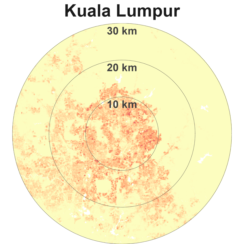
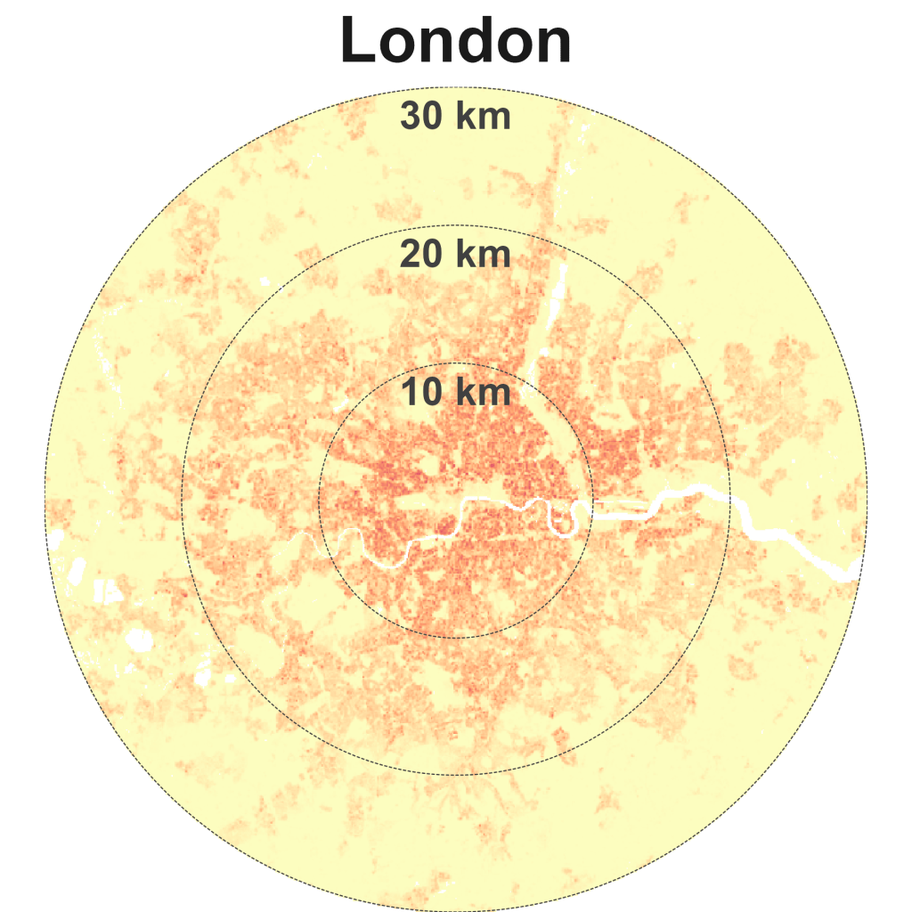
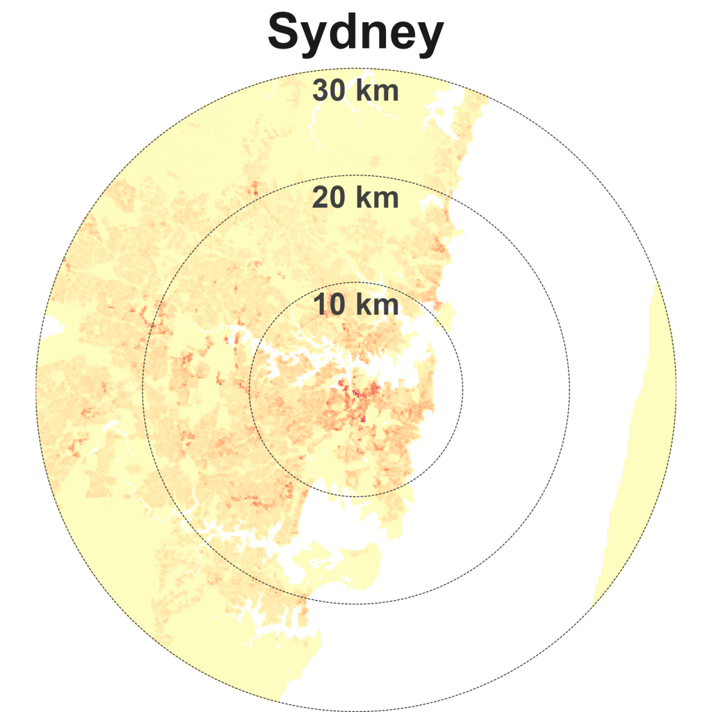
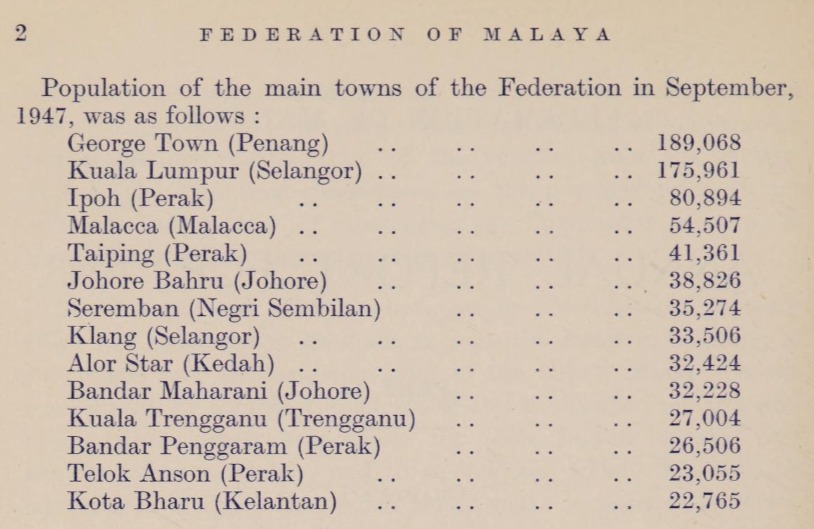
Much of KL’s growth was centred around the area near the confluence of the Klang and Gombak rivers. KL was made the capital of the Federated Malay States in 1896 and subsequently the capital of the Federation of Malaya. However, half-a-century later in 1947, KL still had a smaller population than George Town in Penang and Singapore (Exhibit 10).
George Town had a population of 189,068 versus Kuala Lumpur’s 175,961. With a population of 676,659, Singapore was nearly 4 times bigger than KL. Fun fact – in Exhibit 10, Bandar Penggaram known as Batu Pahat is erroneously stated as belonging to the state of Perak instead of Johor.
In recent decades, Kuala Lumpur has experienced a hollowing out of its core as key functions and industries moved to other parts of Greater KL. For instance, the majority of federal government services relocated to the new Federal Territory of Putrajaya that was created in the 1990s while the main international airport in Subang was displaced by the new Kuala Lumpur International Airport, 45 km south in Sepang.
Saudia Arabia announced its linear neighbourhood, The Line in Neom in 2021, aiming to complete 5 km of the city by 2030 and 170 km by 2045 (now drastically scaled back). Malaysia was ahead of the curve with its own linear urban development, the Multimedia Super Corridor (MSC) launched in 1996.
The MSC stretches over an area 15 km by 50 km, from the Petronas Twin Towers in the north all the way to the Kuala Lumpur International Airport in the south. Sprawl WAS the plan. I found this very 1990s retro infographic on the MSC (Exhibit 11). I didn’t realise there was a plan to call the wider area “Megajaya” (possibly coded for Mahathirjaya…). I’m not kidding about the Megajaya bit, there’s archival material online from Bernama .
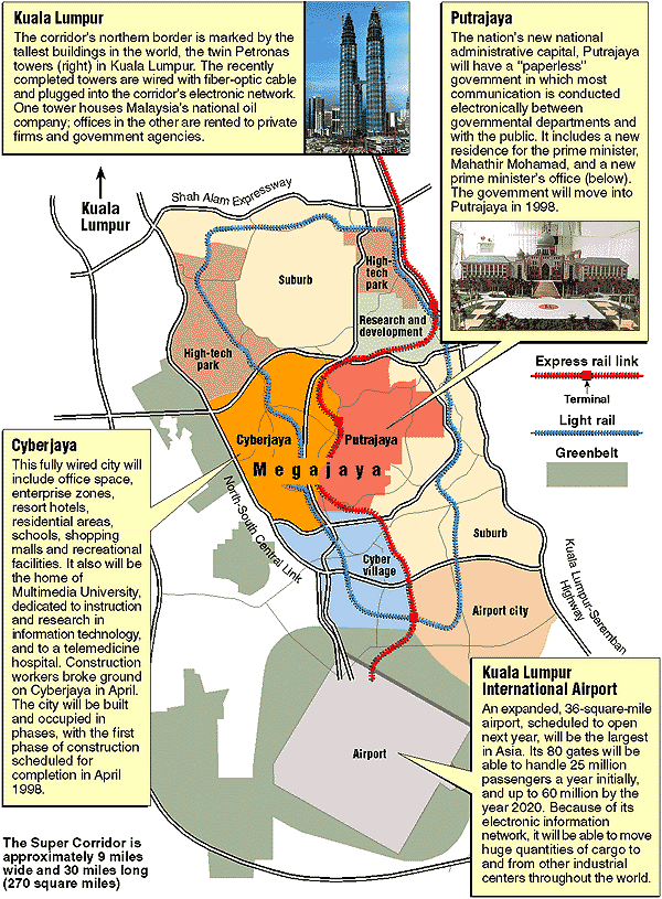
I guess it’s safe to wager a guess that the Multimedia Super Corridor wasn’t a resounding success, since Kuala Lumpur is still a relatively compact and sparse city? We examine the city’s trajectory later on, to see how KL’s population-weighted density and distance have changed over time.
A quick note on London, is its lack of sprawl because of or in spite of its green belt policy? See for example, a 2023 article from The Economist – “Britain’s green belt is choking the economy” here.
Dense, sparse, compact, spread – your questions answered
What centre points did you use when analysing the global cities?
The list of centre points can be found here.1
Why did you choose a radius of 30 km for the maximum distance of the city?
There are two general approaches I could have used – pick a fixed distance, e.g., 30 km or use a dynamic distance based on the city’s boundaries, i.e., a different distance for each city. Using a dynamic distance would have required further analysis and assumptions. Administrative boundaries rarely reflect realities. There is a GHSL dataset on urban boundaries of global cities which I could potentially have used. A fixed distance has limitations since not all cities have similar sizes and shapes. For instance, KL’s growth towards the north and east is hampered by its geography while Singapore being an island nation has limited room. 30 km may seem arbitrary but other researchers have used a similar range. In my analysis, the 30 km limit appears to be on the lower end for sprawling cities like Tokyo and Jakarta. Specifically, the radius for Singapore and Hong Kong were set at 20 km and 25 km respectively. This was to exclude Johor Bahru (Malaysia) from Singapore’s analysis and Shenzhen from Hong Kong’s analysis. Incidentally, including these other regions would have given understandably different(ly interesting) results.
You used GHSL population data at 100 m resolution for your analysis. What if the resolution used was more/less granular?
I actually experimented with both GHSL and WorldPop 2020 data at 100 m and 1 km resolution. I chose 2020 as the base year for all analysis. There is WorldPop 2025 population data at 100 m but not for GHSL. Directionally the results don’t change much. From the literature, 1 km resolution is commonly used rather than 100 m which might be too micro in reflecting people’s experiences of the city. However, I have chosen 100 m resolution for the urban density map visualisations as the patterns are clearer to spot in identifying whether cities are more dense, sparse, compact, or spread. Using larger resolution (e.g., at 1 km) smoothens out interesting patterns.
How does Kuala Lumpur’s urban density trajectory from 1980 to 2020 stack up
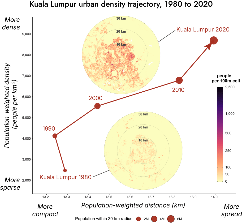
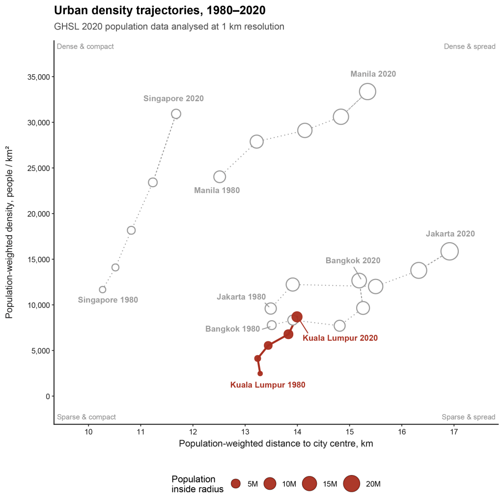
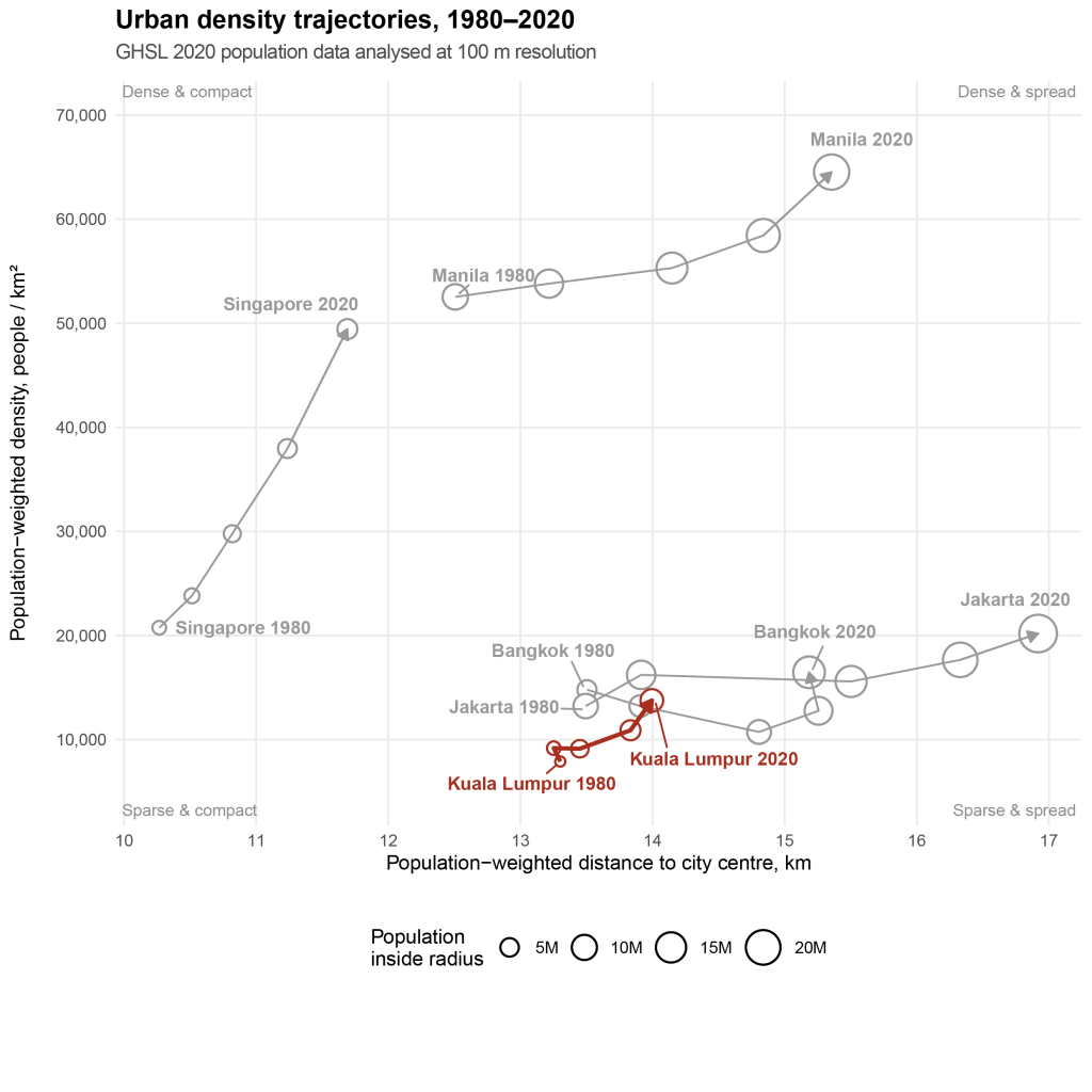
Over 40 years, Kuala Lumpur has become more dense and spread (Exhibit 12). Its population within a 30-km radius grew 6.7 times from 1.2 million in 1980 to 7.9 million in 2020. During that period, population-weighted density only increased by 3.5 times from 2,471 people per sq km to 8,687 people per sq km. Population-weighted distance shifted by 0.7 km.
From the data, other than a blip from 1980 to 1990 when KL became more dense and compact, KL’s trajectory has been increasing density and spread.
However, in the grander scheme of things, KL’s trajectory isn’t as dramatic as other cities in Southeast Asia when you zoom out (Exhibit 13). Singapore’s density increased to around 31,000 people per sq km while Jakarta spread out.
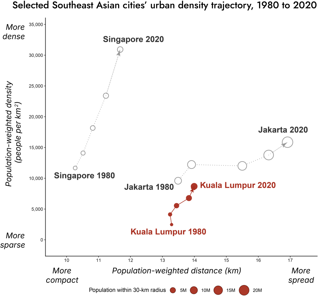
I also made a quick unpolished version that includes Bangkok and Manila (which I originally excluded for layout and formatting reasons) at 1 km (Exhibit 14) and 100 m scale analysis (Exhibit 15). The results are essentially similar other than the fact that at the 1 km scale, outliers with high density are smoothened out. Relative to its Southeast Asian neighbours, KL hasn’t spread out much. But neither has it really densified.
Can liveable density be the goal?
I’m running out of steam. Today is Sunday. I started writing this post 14 hours ago and only stopped for lunch and bio breaks. Yesterday (Saturday) was spent entirely working on this project too. Adjusting and readjusting and tweaking and retweaking the formatting for one chart to get it just right can take hours. And then you realise the wrong data was used.
I’ll quickly wrap up and share a few brief thoughts here. I’ll be the first to admit that this section could be stronger but a fuller in-depth discussion is needed to do justice to these policy recommendations. The intention is to investigate other dimensions of sprawl in future posts.
Kuala Lumpur doesn’t need to be as dense as Hong Kong or Singapore but it certainly has plenty of room to increase density in the right places. Higher density that is well managed benefits cities and its people.
Mass public transit becomes more viable – rules-of-thumb suggest population densities of upwards of 10,000 people per sq km are needed. There is also an entire body of research on innovation in cities where denser cities increase the frequency of “collisions”, i.e., people meeting each other and exchanging ideas, which increases how innovative cities are.
What could KL do. Briefly here are three suggestions. Feel free to throw your own at me.
1. Densify near transit:
a) Build more transit-oriented development (TOD) around key transit hubs – the upcoming MRT3 line provides plenty of opportunities.
b) Optimise density restrictions – relook at existing plot ratios, perhaps they aren’t high enough.
2. Connect neighbourhoods
a) Invest in last-mile connectivity – Rapid KL On-Demand (Demand Responsive Transit, DRT) can’t be a viable long-term solution that replaces regular buses?
b) Promote walkability – make it safer and easier.
3. Optimise underused land and buildings
a) Promote adaptive reuse of buildings, especially in the innercity, focused on target demographics, including key workers and young skilled workers.
b) Optimise infill development and stitch up the gaps between plots with different owners.
Higher liveable density could perhaps address many of the problems plaguing Malaysians and their cities. Including expensive transport spending on fuel for private vehicles and public health issues due to a lack of exercise (driving instead of active mobility).
Which leads me to the TL;DR I started this post with: Kuala Lumpur isn’t simple sprawl. Compared with global peers, KL is unusually compact but still relatively sparse. That means KL has room to grow inward, connect better, and make density liveable.
Is this conclusion trivial? Regardless of the answer, the aim of this project was to interrogate the data on sprawl. You may be wondering about other dimensions of sprawl such as density patterns, travel times rather than travel distance, work locations… And how did KL end up on this trajectory? Future posts might just address some of these. Follow me on LinkedIn if you wanna know more.
THE END
[BONUS]: NOTES FROM THE CUTTING ROOM FLOOR
If you have spare time and/or are wondering why did I start this project in the first place, read on. You have my gratitude.
It all began when I chanced upon this curious data visualisation of European population density profiles by George Marshall on LinkedIn (Exhibit 16) . I wondered how Kuala Lumpur, the city that I live in would compare. My hunch was that it would be similar to London’s but with a shallower valley in the middle. What about other Malaysian cities?
Thus began a one-month journey (dare I say ordeal?) that occupied my time outside my day job and colonised the wandering moments of my mind. Answering one question gave rise to another question, producing a never-ending battlefield of zombie questions. The main questions that I can remember are briefly described.
Question 1, which Malaysian cities should I examine? From just looking at state capitals, I eventually, landed on a set of 25 cities that included all state capitals and a few other key cities that I thought might be interesting. The next question stumped me. Where is the centre of any city – is it the historical centre where the city was founded, the geographic centre, the geometrical centre (e.g., the centroid), the Central Business District (CBD), the administrative centre, the main transport hub? Let’s pick one, say the historical centre. Now where is that for Kuala Lumpur? Who decides the official historic centre – is it where the Klang and Gombak rivers literally meet near Masjid Jamek, Central Market, the Sultan Abdul Samad Building (BSAS) opposite Independence Square (Dataran Merdeka)? Any of these would be fair choices but I eventually landed on the zero-kilometre marker.
But not all Malaysian cities have zero-kilometre markers, and some of them weren’t in the historic centre. I tried my best to identify the “real” historical centre. I really did! I spent hours scouring Google Maps and the Internet for these cities and the global cities later on. I determined what were historical adminstrative centres, e.g., official government adminstrative buildings or the general post office. The full list of Malaysian city centres are in the footnotes.2
Question 2 seemed straightforward – what distance to use? How far from the centre should i analyse? In his analysis, Marshall used 15 km so I should just try that first. Writing this I now realise I mistakenly remembered the number 15 when he actually used 16 km. Anyway, I went with 15 km. There were a bunch of questions that I then had to figure out in quick succession.
Question 3: What population data to use? I know that the European Commission’s Global Human Settlement Layer, GHSL (which was what Marshall also used) and WorldPop from the University of Southampton are two open population data sources that are easily accessible and have among the most granular resolution at 100m (i.e., one pixel represents 100 metres in the real world). I could access either through Google Earth Engine, but I was lazy and found an online source that had the exact type of GHSL data I was looking for for Malaysia. Sorted.
Question 4: What radial ring size to use for the analysis? Marshall used 2km rings which I thought was not granular enough. I used 250m rings which in retrospect was not a great choice, since I should have chosen a multiple of 100m, the resolution of my data.
Anyway, using those choices and spending plenty of agonising time tweaking formatting and layout, I arrived at what I thought (and still think) is an aesthetically pleasing small multiples chart (Exhibit 17). My hunch was right – Kuala Lumpur (in the first column and third row) has a valley effect that starts lower from the city centre and rises slightly moving out from the city.
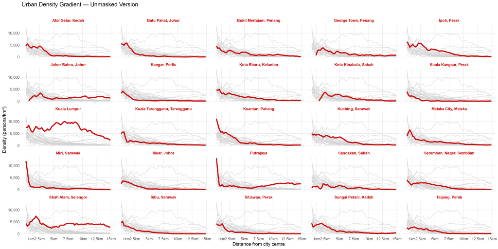
Looking at Exhibit 17, I realised a problem. The largest city Kuala Lumpur has a metropolitan population of around 8 or 9 million that was skewing the results of the other cities. For most other cities, the population was much smaller, e.g., Kangar the capital of Perlis only has about 100k population. I wanted to fit the whole visual on an A4-sized page, so I had to adjust the current y-axis which used a linear scale. My rule-of-thumb is to avoid log scale graphs if they’re gonna be seen by a general audience. Anyway here is the same graph with a log scale y-axis (Exhibit 18).
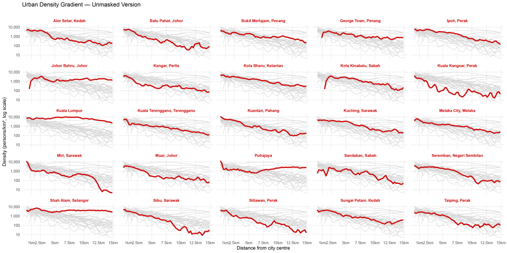
So far so good. Some interesting patterns from this log scale graph. Kuala Lumpur is pretty flat – the valley effect has disappeared with the log scale! Putrajaya the purpose-built administrative federal capital dips and then gently rises. Something weird is happening at the city centre of Kota Kinabalu – an artifact of poor data quality? The smaller towns’ population declines quite fast. For the larger cities, I probably should use a distance greater than 15 km – but what is the magical number?
It then occured to me that there is a methodological conundrum to be resolved. For cities close to the coast or water bodies, obviously the population would dip since Malaysians generally don’t live on houses built over water. So I should exclude water bodies. That is easier than it sounds – water levels are not static and I’m looking at data at 100-metre resolution. Also oftentimes, population density is higher on the coast or near rivers. What chunks of population would I inadvertently exclude by excluding water bodies at different data resolution granularities (e.g., 100 m vs 1 km)?
I had used JRC Global Suface Water Mapping Layers via Google Earth Engine for other past analyses. So for Question 5: Should I include or exclude water bodies? I decided to try the excluded version later on. After staring at the urban density gradient linear and log charts for a bit, it hit me that not everyone would be familiar with all the cities shown. Hence the next question.
Question 6: How to provide context for the unfamiliar reader on the selected cities? I could perhaps show maps of urban density, satellite imagery, road networks… But road networks and the graphs wouldn’t be visible on an A4 page. After even more agonising and experimenting, I had decided what to show. The real killer came next – Question 7: How to make everything look pretty and fit on one page? That took days… and I still didn’t succeed. You can see a version that I was experimenting with below, apologies for the low-resolution – blame WordPress (Exhibit 19).
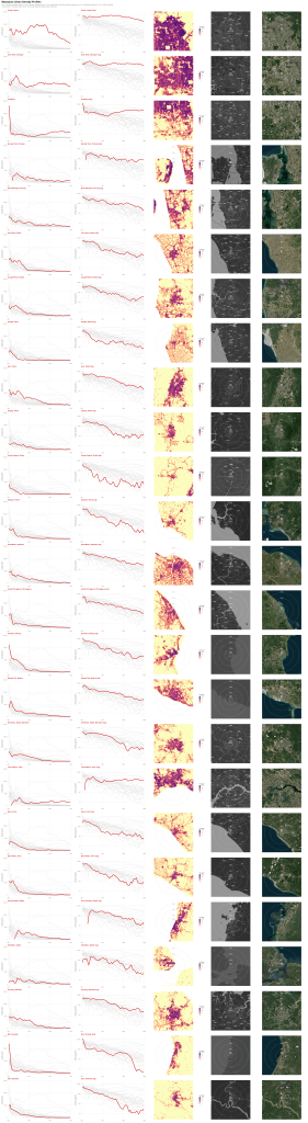
Through the process of providing visual context, I stumbled on another problem. I decided I would exclude water bodies, but what about treacherous terrain that would be difficult to build on? What should I actually include or exclude? Question 8: If I were to exclude water bodies because it would be near impossible for the average Malaysian to live on them, should I exclude other areas, e.g., environmentally protected areas, industrial areas, mining areas, waste sites…? And if yes, then Question 9: Where do you demarcate the boundary of a no-build hilly area? I decided my sanity was more important, so I drew the line of exclusion (yes, pun intended) at water bodies only.
I then decided that one-dimensional analysis (i.e., only distance) was not very interesting and inflicted more pain on myself by asking Question 10: What other variables could I look at? This led to Question 11: What about doing some kind of funky matrix with two variables or more? And then onto Question 12: What really is urban density anyway? and then Question 13: I’m sure plenty of people have studied all of this before, what does the existing literature say?
These led to days of further agony and wonky inaccurate visuals which I share below. I repeat, these are all INCORRECT but I’m sharing them for educational purposes (Exhibits 20 to 22). The most instructive lesson from these exhibits is the sheer amount of often unseen time that is “wasted” or “unproductive” in research. A fair warning to all.
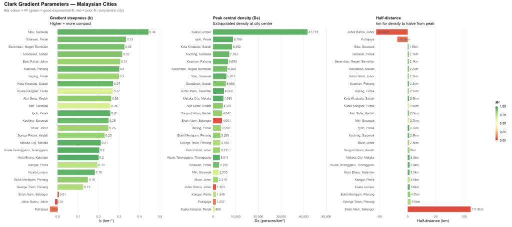
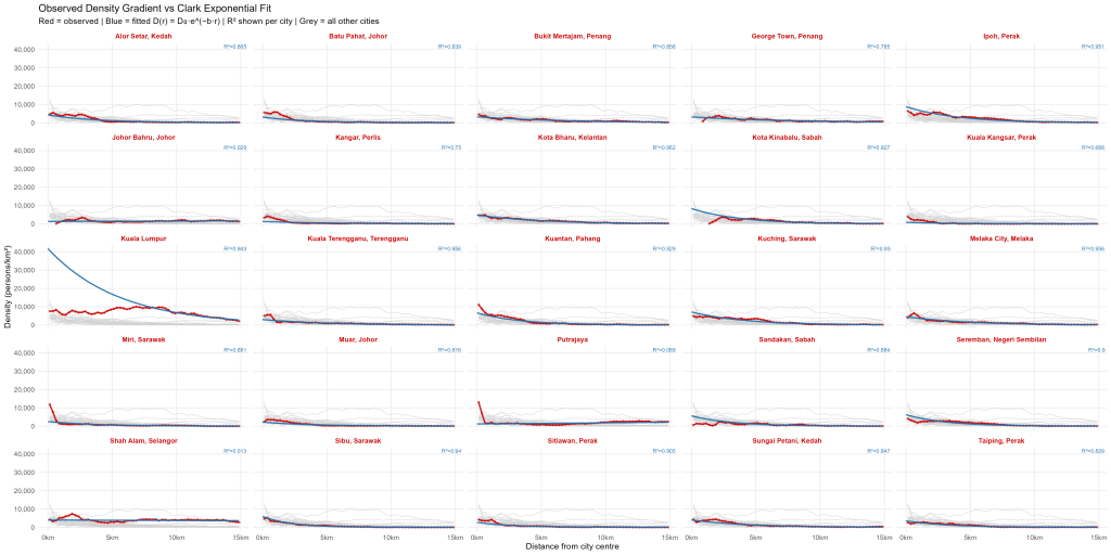
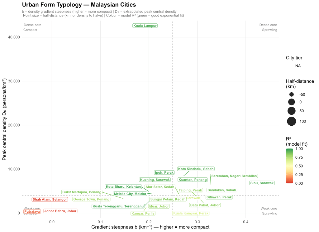
One of my key takeaways thus far was that I should have finished reading Alain Bertaud’s book Order Without Design which is an important primer on urban economics and urban planning. A quick skim through it reinforced the conclusion that I should have read it or at least some of the literature before my foolhardy plunge down this rabbit hole.
Nevertheless I persevered. Perhaps all I had to do was go back to my initial plan of visualising one dimension and ignoring everything else, at least for now. I discussed what I had done thus far with one or two colleagues. The fruits of that discussion was looking at regions that encompassed multiple cities would be interesting. For example, Greater Kuala Lumpur (Klang Valley) includes KL, Petaling Jaya, Shah Alam, Subang Jaya, Putrajaya, Klang, possibly all the way north to Tanjong Malim and southwards past the KL International Airport (KLIA) in Sepang, down to Nilai (and Seremban?!). And the cross-border Johor-Singapore region would be especially pertinent with the soon-to-be-launched Johor-Singapore Special Economic Zone (JS SEZ).
These were sprawling regions. I went down this path for a bit. Then it hit me, what was actually interesting and wouldn’t take months to analyse was urban sprawl and urban density. Perhaps I could reframe this whole thing. I was loathe to abandon all that I had done thus far. That’s why I’ve documented all the above. And proceeded to studying KL’s sprawl compared with other global cities.
A few more notes to self on what I cut out: Using “Dense, Dense, Dense” as the title of this post in reference to Haruki Murakami’s novel “Dance, Dance, Dance” a novel I read nearly 20 years ago but barely remember the plot of. And Arcologies from SimCity 2000 (https://simcity.fandom.com/wiki/Arcology).
Footnotes:
- The list of centre points used are given in the following format: [City name] : [Location of centre point], [Geocoordinates (longitude, latitude)]. A radius of 30 km was analysed unless stated otherwise.
1. Kuala Lumpur: Zero-km marker near Dataran Merdeka (101.6945, 3.1488)
2. Paris: Zero-km marker ( 2.3487, 48.8534)
3. Beijing: Tiananmen Square (116.3976, 39.9055)
4. Jakarta: Monumen Nasional (MONAS) (106.8271, -6.1753)
5. Bangkok: Grand Palace (100.4916, 13.7498)
6. New York: Empire State Building (-73.9857, 40.7484)
7. London: Charing Cross (-0.12769, 51.5074)
8. Los Angeles: LA City Hall (-118.2429, 34.0538)
9. Singapore: Former City Hall (now the National Gallery) (103.8518, 1.2907) Note: A 20 km radius was used to exclude Johor Bahru, Malaysia from the analysis.
10. Hong Kong: Statue Square (114.1597, 22.2811) Note: A 25 km radius was used to exclude Shenzhen from the analysis.
11. Tokyo: Imperial Palace (139.7521, 35.6825)
12. Seoul: Gwanghwamun Square (126.9767, 37.5728)
13. Manila: Plaza de Roma, Intramuros (120.9731, 14.5921)
14. Mexico City: Zocalo (-99.1331, 19.4320)
15. Mumbai: BMC Headquarters (72.8353, 18.9400)
16. Dubai: Al Fahidi (55.2972, 25.2631)
17. Istanbul: Sultanahmet Square (28.9757, 41.0063)
18. Lagos: Tinubu Square (3.3894, 6.4538) 30000
19. Sydney: Sydney Town Hall (151.2061,-33.8732) ↩︎ - I will add the cities later on. I really am tired… ↩︎


