
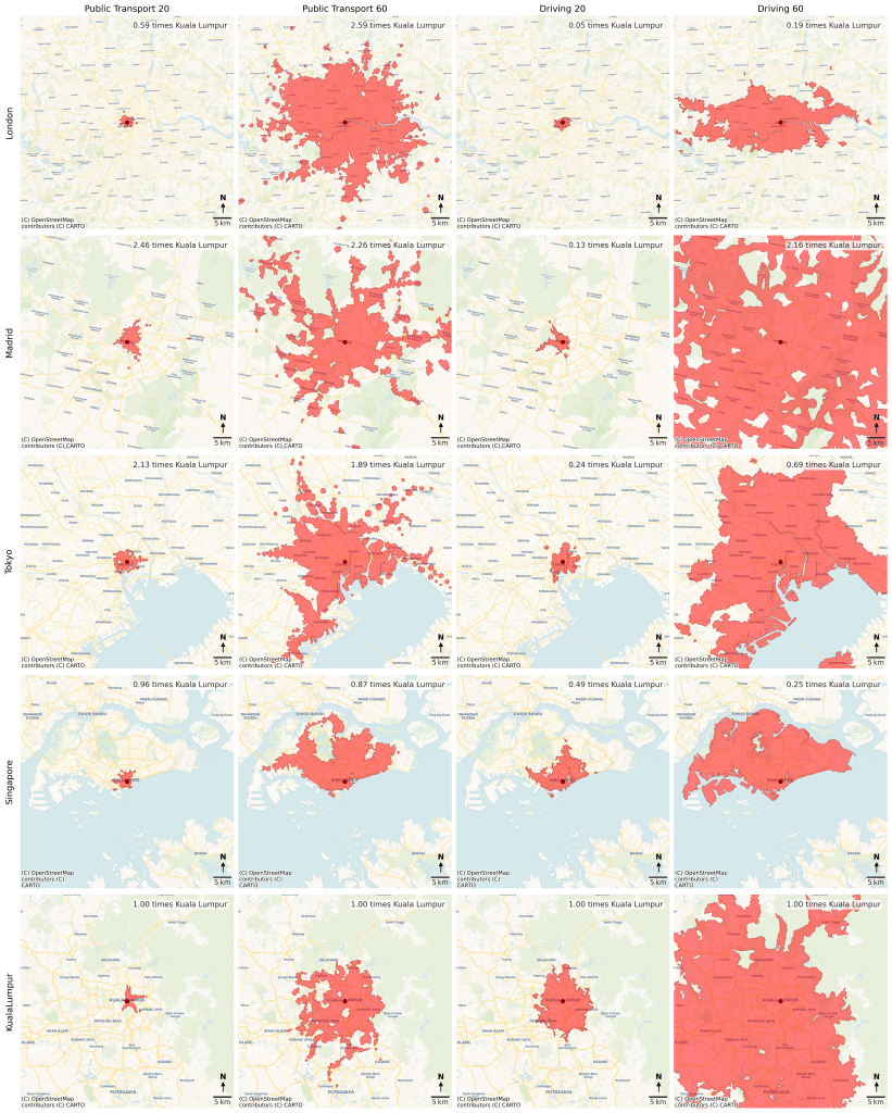
In just one hour, a Londoner can ride the Tube/Underground and cover 2.6 times the area a Kuala Lumpur commuter can. If you’re in Madrid or Tokyo, your coverage is roughly double. Until the MRT3 Circle Line is ready, woe is us.
I discovered this over the weekend. Not by gallivanting round the globe but by sitting at my desk, reacquainting myself with spatial analysis. It’s been a year since the end of my sabbatical. I must admit with great shame that I have barely touched Python and R since. At work, I’m in meetings/discussions, reviewing/editing, and productively procrastinating.
As always, the hardest part was taking the first step. While debugging is frustrating, producing this was fun. It’s past midnight and already Monday, so take what you will from this work-in-progress visualisation.
1. Introducing the isochrone: This visual compares 20-minute and 60-minute coverage by public transport vs driving. These are called isochrones, lines that connect all reachable points within the same travel time from a given point.
2. Cars R Us: They say Paris is a city for lovers and Beijing is a city for bureaucrats. Here is further evidence that KL is a city for the automobile.
3. Show me the data: I got the data from TravelTime’s API. Initially, I experimented with MapBox but TravelTime wins with free transport journey data. I set arrivals to the city’s centre point at 8.30am local time. The isochrones show how far one can travel from to arrive in time for work at the centre point (the red dot).
4. How did I choose the centre point?: I didn’t calculate a centroid (the mathematical centre of the isochrone. I chose the centre points based on the historic zero-kilometre marker for each city. For KL that’s Dataran Merdeka, London at Trafalgar Square, Madrid at the Puerta Del Sol, Tokyo at Nihonbashi Bridge, and Singapore at the Fullerton Hotel (former General Post Office). You could run this analysis with any starting point of your choice. Say a train station or central business district.
5. (Vibe) coding: The work was done in Python. Generative AI (I used ChatGPT o3) has advanced so far so fast. If you’re lazy, you can get by just “vibe coding”. But the real value is making it your infinitely patient teacher and servant.
6. What else?: Given more time, I would have loved to do more. For example, adding population density/counts and effective/realistic city boundaries to estimate what percentage of the population can reach the centre in an hour. Commuter zones and travel areas are understudied topics in Malaysia. The curse of poor Malaysian data!
7. To be continued?: This might be a proper blogpost if I can find the time. While waiting for that unlikely event, you can hear me ramble and watch me do what I love doing best – going-off tangent and down rabbit holes here: https://joelgoh.org/2025/06/15/reading-a-pattern-language-1-independent-regions-or-the-cultural-spheres-of-crummy-new-yorkers
