
Note: This is a very slightly modified version of a LinkedIn post I wrote in December 2025. The original post can be found here. In retrospect, I would have experimented with visualising the dot density maps differently.
Completed just in time for the holiday season! Check out this Christmas-themed (lol) data visualisation of election results using the festive colours of Pakatan Harapan red and PAS green (representing non-PH votes and seats). I wanted to do a whole lot more but my Christmas feast beckoned.
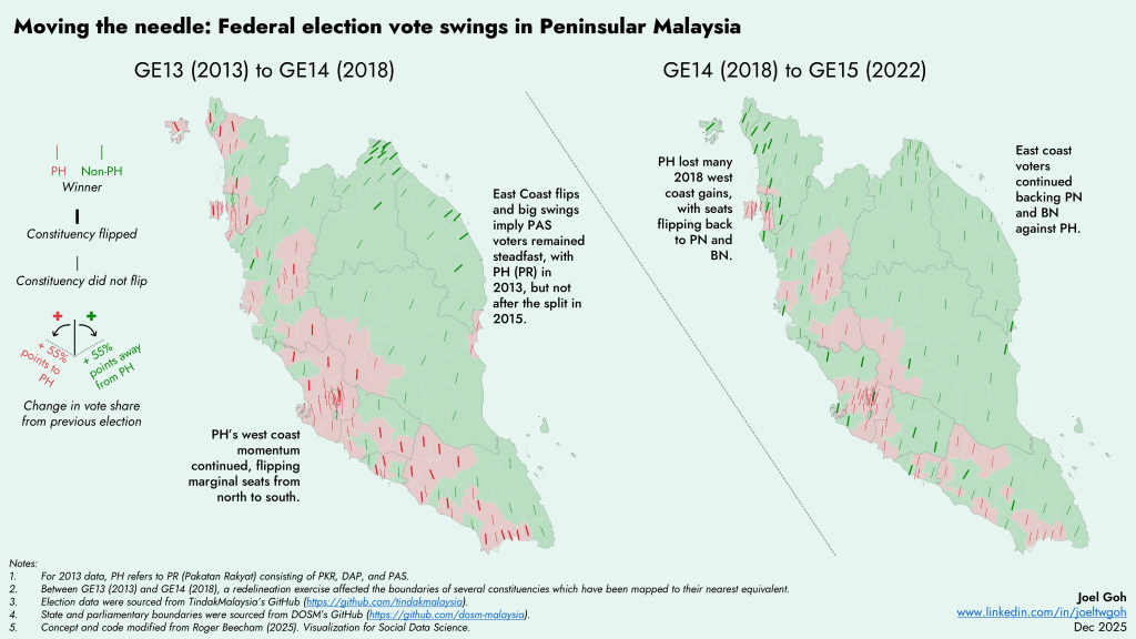
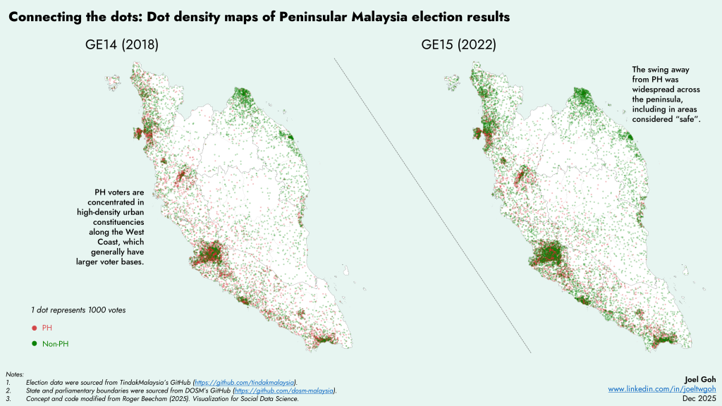
Visualisation approach and code inspired by Roger Beecham’s book Visualisation for Social Data Science (2025). Election data sourced from the always awesome NGO TindakMalaysia (https://lnkd.in/gW-Z2GPF) and electoral boundaries are from DOSM.
