
Note: This is a very slightly modified version of a LinkedIn post I wrote in December 2025. The original post can be found here.
TL;DR: Malaysia is highly centralised, centred around the Klang Valley and is more geographically concentrated than Germany, the US, or the UK.
In 2023, an article in the Financial Times caught my eye (see Exhibit 1). Without its richest region (London), the UK’s average GDP per capita would fall by 14%. This was much higher than the equivalent figures for Germany (1%), Netherlands (5%), and the US (4%). I wondered what it would be for Malaysia. My guess was that we would be similar to the UK.

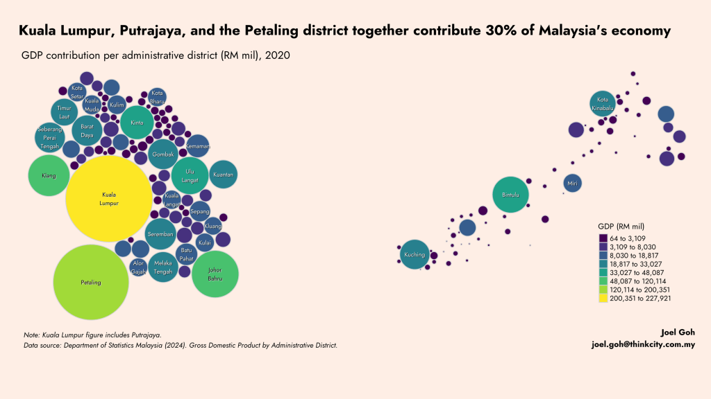
Two years later, I finally got round to doing this analysis using 2020 administrative district data from the Department of Statistics Malaysia (Exhibit 2). The answer is that Malaysia would be 18.4% poorer per capita without Greater Kuala Lumpur which is also known as the Klang Valley (Kuala Lumpur, Putrajaya, and Selangor).

It came as a surprise that Bintulu has the highest GDP per capita (purchasing power (PPP) adjusted), nearing San Francisco levels (!), driven by the oil and gas and petrochemical industries (Exhibit 3). This was followed by Barat Daya in Penang (Pulau Pinang) where multinational and local companies in the semiconductor industry reside, with GDP per capita higher than London, Amsterdam, and Chicago. In third and fourth place are KL & Putrajaya and the Petaling district, key districts in the Klang Valley.

The Klang Valley is indeed Malaysia’s main economic engine as Kuala Lumpur, Putrajaya, and Petaling together contribute 30% of Malaysia’s economy with 13% of the population.
Alert readers would be thinking, what about household income? Indeed, administrative district household income may not track economic productivity measured by GDP per capita. People may live and work in different districts. Registered addresses of companies may differ from where their activities take place. These are a few real world reasons why household income and economic productivity may paint very different pictures.
There are also theoretical reasons, e.g., how geographical boundaries are defined and what conversion factors to use to translate Malaysian Ringgit to PPP-adjusted US dollars. Finally, methodological choices also shape results and affect readers’ perceptions. For example, visualisation decisions on colour scales, number of categories, and axis scales (in this case, using log scale for the charts).

Side note: These visuals emphasise the importance of Think City’s place-based approach, focusing on relatively poorer regions. For example, our Levelling Up Seberang Perai Programme (LUSP) is focused on Seberang Perai Utara, the poorest district in Penang while our Northern Region Archaeotourism Network includes Kuala Kangsar and Hulu Perak which are at the bottom for Perak. And while KL is a highly productive region, our work such as Warisan KL focuses on rejuvenating the old city core which has hollowed out and has experienced declining economic productivity.
FT article that inspired this post: https://shorturl.at/ICf2Q. All images by me, except the last which is by the author of the FT article.
